
Farley’s Fit Kitchen
A CASE STUDYI met Chelsea Farley (owner of Farley's Fit Kitchen) through some buddies I used to ride motorcycles with. Thomas Farley, her brother was in our group. The guy I knew, Reid, happened to know I did branding and websites and introduced Chelsea and I. This must have been around 2018-19.


Reid mentioned that Chelsea was starting a “Meal Prep” thing and basically had no budget to work with and asked if I could give her the “Bro discount.” I didn’t have anything else going on at the time and since I’m always happy to help a friend, I accepted the job. Little did I know then that this favor, would turn into one of THE BEST family owned Meal Prep companies in the Greater Houston Area.
BRAND IDENTITY

When I eventually met Chelsea in person, they were expanding into an old Domino’s pizza shop. I guess they had started word of mouth but were growing enough to need a brand, a website and a physical kitchen.
The concept of Farley’s was interesting and new to me at the time, as it wasn’t a restaurant you can sit in and eat in. You order your meal to-go, but it wasn’t just for one meal, it was for the week. They either deliver it or you pick it up. No dishes, no cooking, always healthy and always easy, never any fuss.
For the logo I knew immediately I wanted to find a way to blend the letter “F” for Farleys with something healthy and the carrot logo was born. They had already had the text done somehow, so I wanted to incorporate that, but for some reason the carrot logo was a major hit and it just stuck. We slapped it on everything.
WEB

I knew immediately I way undercharged for the website but I was excited to be part of this living breathing new start up and I didn’t want my prices to get in the way of the early success of Farley’s Fit Kitchen. We needed a way for people to order online, I’m not sure how she and her team were handling the orders before, but they quickly found the Toast system and built out there menus. I quickly crafted a website and linked their system with the forward facing Farley’s site and the rest is history. We’ve added print on demand merchandise, instagram feeds, FAQs and more, and the site is completely mobile responsive for our “On the go” users.
The website currently hosts over 4,000 monthly visitors, 3,400 of them being unique visitors with over 7,300 page views per month.
I still maintain and update the website for Farley’s and make updates as needed. Chelsea and her team have been a delight to work with over the years and treat me like family.
INSTALLATIONS
Upon moving into the new to them, but still very much “Dominos” pizza space, Chelsea asked what I could do to help make the place feel like Farley’s. The problem again was they were working with a small budget and didn’t know where to start. Fortunately for me, I lived just around the corner so it was easy for me to swing by, take photos and measurements and help guide them on their way.


By taking photos, I could photoshop the walls with the proposed paint colors so that Chelsea could see the space in the new colors without painting the shop and therefore saving her both time and money.
As the company continued to grow, Chelsea had more cash on hand for fun projects. The first being, let’s really make the place feel like Farley’s. So the first hedge wall was born and became a staple with the customers. Customers could take photos with the Farley’s logo in front of the built in photo wall. Again, being around the corner, I just popped in measuring tape and ladder in hand, measured three times, took photos, and again photoshopped what could be. Chelsea loved it. Since I had taken precise measurements I was able to estimate exactly what the cost of supplies would be, placed the order and got to work.
I also worked with vendors on behalf of Chelsea to design and get prices for their iconic NEON LED signs that have quickly become a staple for their shop. I’ve placed one mock-up of the HEALTHY AF LED Sign as I don’t feel like going through 10,000 old photos to find a real one. But it just goes to show you the level of expectation and follow through I have on my designs. “Here’s the concept, it will cost $XX.XX and I can have it done by _______” That’s the level of service that I provide.
Since Chelsea could clearly see how her space would turn out, the designs, costs and decision to proceed was a no brainer.


Well as any successful business does, they grow. And the shop grew too. When Chelsea moved to their 2nd location, I was called up again to make sure the once Mexican restaurant was transformed to feel just like Farley’s. Except this time, it was much larger than the first shop. They really put my skills to the test on this one as interior design is not my strong suit, but I worked with Chelsea to come up with an approved solution that she could hand off to her painters and the vision came to life for the second time. But this time with an even BIGGER hedge wall and new LED Signs. I think the second hedge wall took over 8 hours to install… I did it myself and my fingers and hands were destroyed. But it’s amazing in person. What I like most is that it naturally evolved and they decorate it seasonally with stockings, or spider webs for the major holidays.


GRAPHICS & PRINT
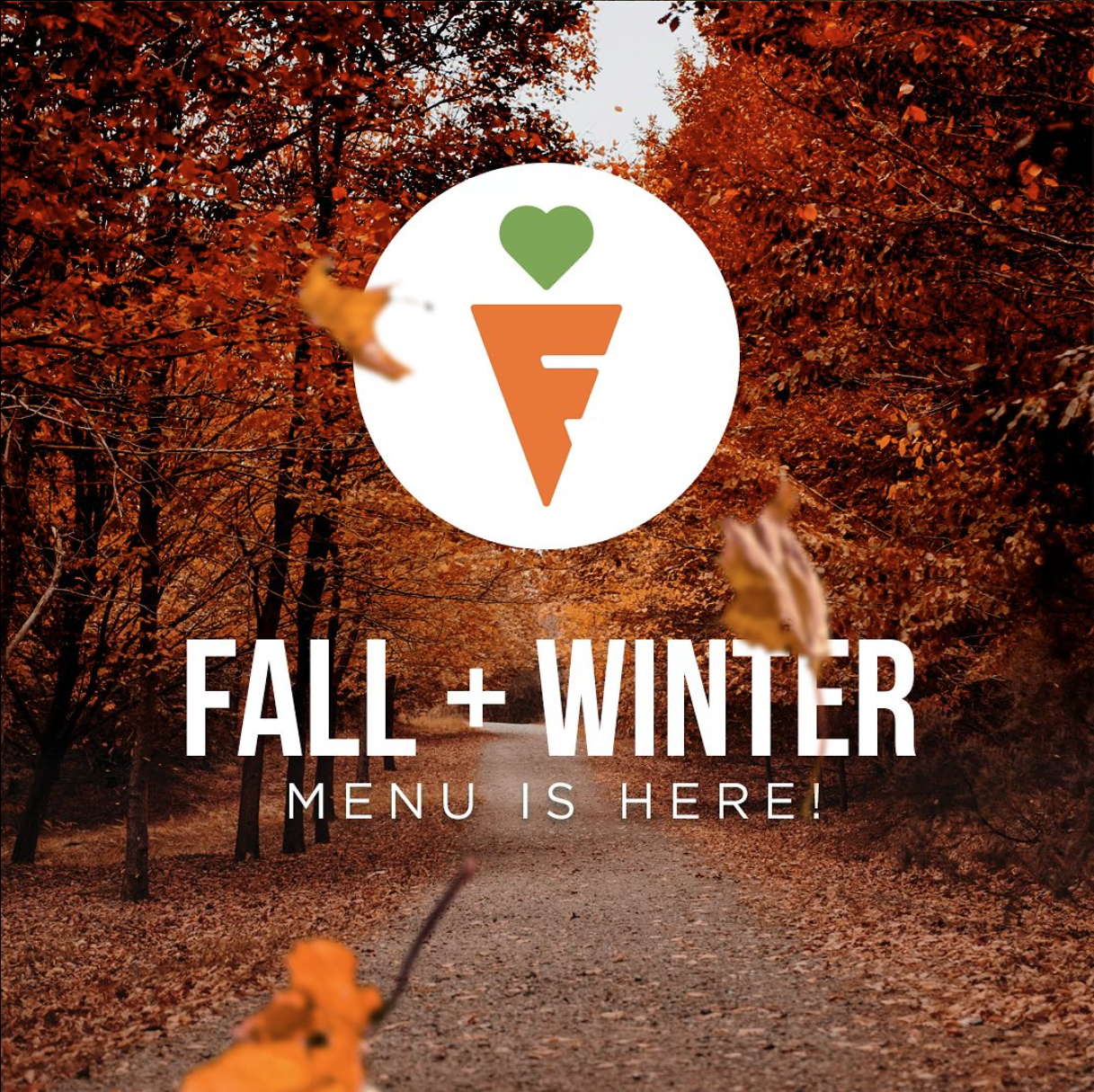
What’s a restaurant without a menu? I’ve been designing the menus since the beginning. After about the 2nd menu we started adding different designs just to change it up. Since Farley’s changes the menu seasonally so it doesn’t go stale, the design and graphics shouldn’t be either. Below is a collection of menu designs I’ve created for Farley’s over the years. Of course I’ve also done business cards, stickers, merchandise and everything else under the son for Chelsea.


CONSULTING
This is where I think I’ve earned my keep and really have helped to put Farley’s in a good place. Because of all the creative consulting over the years, I’ve gotten to take a peek under the hood and see what systems make Farley’s Tick.
Now, I will take a moment to say, Farley’s had explosive growth and through that growth Chelsea and her team were just doing whatever they could to make sure everyone go their order on time and correctly.
Sometimes when we are just racing towards the solution, we’re too close to the problem and can’t see a better solution.
That’s where I came in..
Delivery Mapping
The Farley’s Team was paying someone hourly to map all of the delivery routes using map quest. I quickly found a better solution, which for Farley’s competitive sake, I won’t explicitly name here, but it allowed for the bulk input of delivery addresses as well as real time tracking of drivers. The routes were then mapped to an app the drivers could follow and could be rerouted on the fly as needed.
This system saved Farley’s HOURS each week. Instead of pre-planning all the deliveries, it was an easy upload and go. Now they have more man-hours where they need it and the drivers can deploy confidently while HQ can keep tabs on them or change routes in case of trouble.
Bulk Texting
The staff member doing the delivery routes was also bulk texting the customers letting them know when they can expect their order to be delivered. Yuck. Not only was Chelz paying for a phone line to do so, she was paying someone hourly to do it. Again, let’s clean that up and make it more efficient. I found a solution that took the names and phone numbers from the point of sales system and automatically sent text messages to their customers day of. This system would run on its own and saved Farley’s Hourly wages and a phone line as it used Google Voice, setting them up perfectly to scale.
Custom Order Stickers
Farley’s prides itself in allowing custom orders for their customers. You want double protein, you got it. Double carbs? Sure thing. But keeping track of these orders on delivery day and in the walk-in freezer was proving difficult. So I suggested we add “Custom Order Stickers” to the food containers. That way, the customer knows they’ve gotten a custom order, just like they liked, AND the Farley’s team could quickly see which orders were customized as to not send that meal with a different delivery driver or to a different customer. The red stickers are an easy indicator to double check the smaller printed label and make sure that meal gets a little bit of extra care.
Advertising & Campaigns
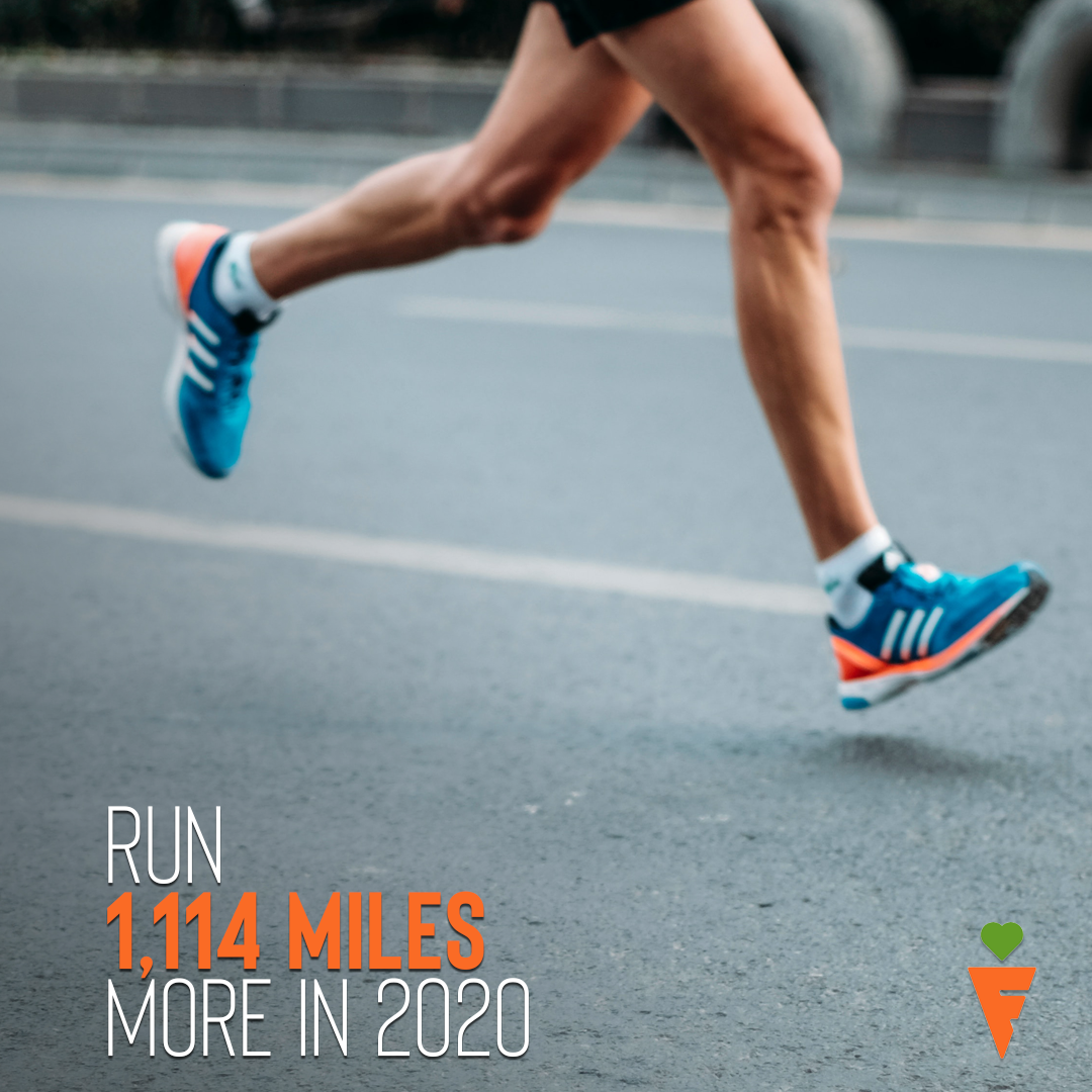
New Year 2020 - As we all know, the new year typically comes with a New Year’s Resolution. Typically gym memberships rise and the vow to lose some weight is at the front of everyone’s mind. To capitalize on this fact, I created some ads to help showcase why Farley’s is better and how it can help them to reach their goals faster.


Dare 2 Compare - Chelsea approached me with a problem; People just look at other delivery apps and prices and think that we are a waste, can you come up with a campaign to help disprove that? Sure can. Enter Dare 2 Compare, a brand awareness campaign that dared customers and potential customers to try and beat Farley’s Fit Kitchen on Price, Nutrition and Delivery Fee. If they could they’d get free meals, and the first person to do it would go home with 90 meals (1 full month) of free food, a value of over $1,000.
Of Course no one could do it, and a Chelsea had lots of meaningful conversations with her customers about how they never knew how much better Farley’s actually was than the competitors on price and nutrition.
What I Made:
Initial Plan & Concept
Webpage & Content
Entry Submission Form
Rules & Requirements for Contest
Social Media Posts & Reminders
Flyers
Email Graphics & Wrote Emails
Custom Look & Logo for Competition
The Results:
Over 600 unique persons to the Dare 2 Compare Entry Page
Zero Entries That Won
Increased awareness of how good Farley’s is in Nutrition, Price and Delivery Fee


In Conclusion

Overall I’ve been very blessed to be part of the explosive growth that Farley’s Fit Kitchen has had over the years. Giving them their iconic look and logo, creating a custom space for their needs as well as helping them to improve their internal systems has been a joy. I am grateful to have such a trustworthy client and friend through Chelsea and am excited to see what the future holds. It is an honor to be part of the Farley’s extended family.
Chelsea often tells me “thanks for working on the little guy” (referring to her seemingly larger than last time we spoke, business) and I am often included on many of their major planning and purchases. It has been an honor helping her and her company interface with their beloved clients through web, marketing and branding and I am excited to see what the future brings for her and her business. I keep telling her she needs to find a way to replace herself so she can launch another kitchen, but one step at a time.
Also… She got the logo I did tattooed on her arm. What a client.
If that isn’t a testimony of how much she loves the brand I’ve helped her create, then I don’t know what is.
I am truly honored to be part of the Farley’s Family. 🧡💚